
In e-commerce, it is user experience that makes the difference between
a completed purchase and an abandoned cart.
Background and pain points
Prior to 2019, customers who want to add a new mobile line through e-commerce channel faced a very complicated purchase path built on legacy systems that didn’t support responsive design. Only one transaction type was allowed at a time. For example, during the promotion period like a new iPhone launch, a multi-line account customer often needed to add a new mobile line and upgrade an existing one simultaneously. Due to the technical limitation, they had to complete separate transactions for each, i.e., one transaction for adding the new line and another for upgrading. In addition, customers couldn’t take advantage of promotions such as prom codes or BOGO offers during online transactions. These issues led to poor customer experience and low conversion rates (<3%).
Design objectives
The project aimed to create a simple, intuitive self-service digital acquisition experience for existing T-Mobile customers, built on the new Angular framework. I defined four specific design goals:
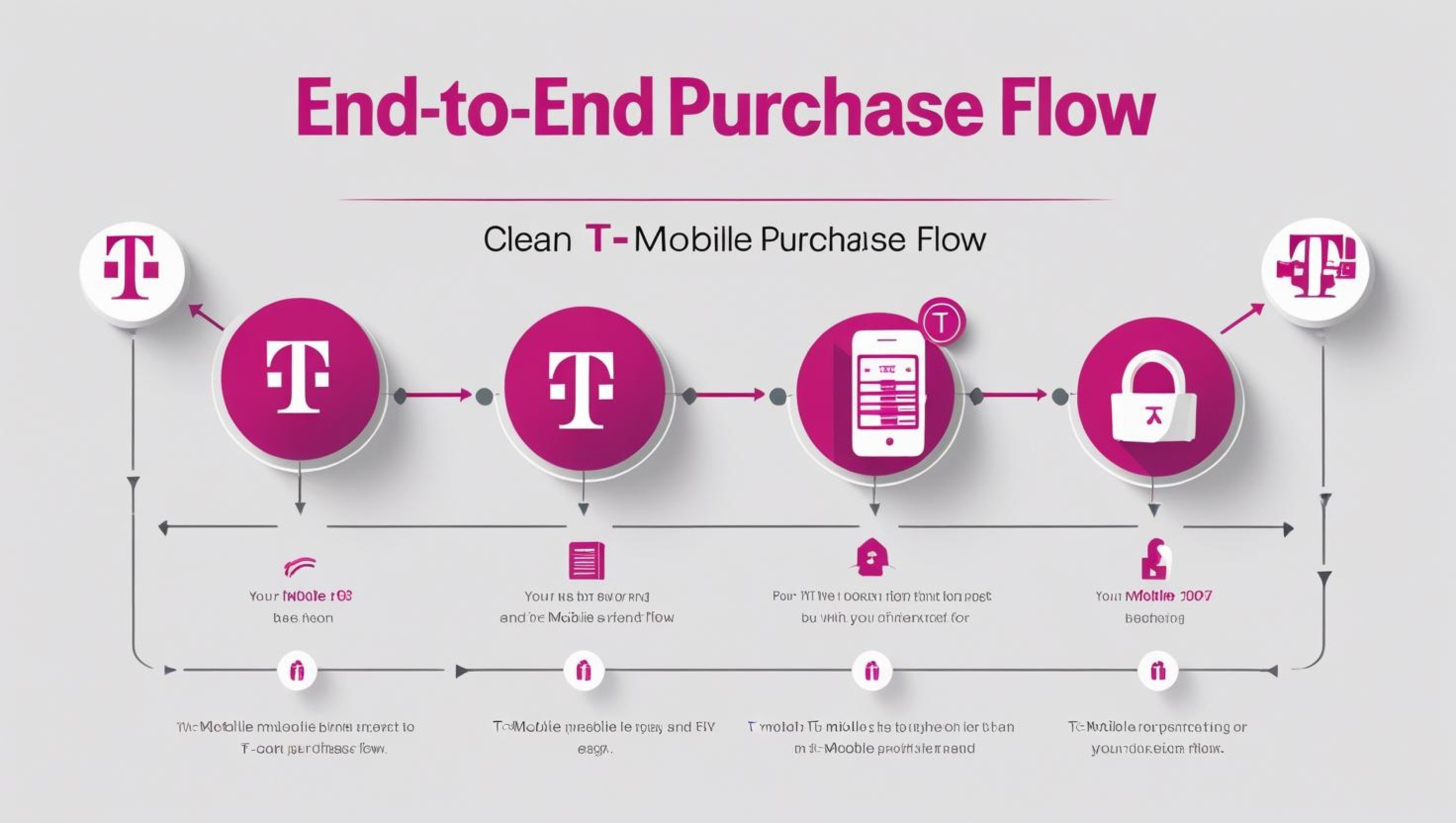
Simplify the Flow
Streamline and simplify the online purchase path
Promotions Made Easy
Display offers and accurate pricing
Responsive by Design
Ensure a seamless experience across devices
One Unified Experience
Bring upgrades, accessories, and add-a-line into a single flow.
Research methods
Together with user researchers, I applied a range of methods to build a comprehensive understanding of customer needs and pain points. These efforts focused on four key research methods used for this project:
Web Analytics
Data of the current site, including heat map, funnel analysis, click-throughs and drop-off pages.
User Testing
Usability testing, focus groups, and video observations to validate design decisions.
Customer Insights
Cross-channel feedback from chats, support calls, retail records, survey data and usability reports.
Market & Competitive Research
Industry reports, white papers, and competitive analysis to understand broader trends.
Design Principles
Good design removes friction and builds trust. These four guiding principles shape my approach to ensure that every interaction is intuitive, supportive, and enables users to achieve their goals with confidence.
Simple
Making the buy flow short and clean so that users can accomplish the task easily
Considerate
Present a clear shopping cart with key pricing details, helping users feel confident to proceed.
Smart
Provide a customized experience that reflects each user’s purchase intention
Organized
Arrange information in a way that feels clear, approachable, and easy to scan.
Metrics
To evaluate whether a project achieves its goals, I track a set of key metrics that reflect both business performance and user experience.
Conversion rate.
Transaction share on digital channels, both in mobile and desktop.
Cart abandonment rate.
Customer satisfaction score.
Page view.
Promotion redemption rate.
Design Comps
Here are selected design comps and examples from the project, which was released in January 2019.
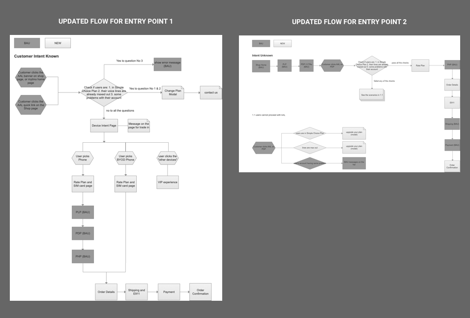
Example 1: Define the flow for AAL (Add a Line) in online store
Redesigned the ‘Add a Line’ flow in the online store, simplifying steps and reducing friction. Validated the new flow through UserZoom testing, where 75% of participants preferred the redesign.
Example 2: Redesigned the Purchase Intent Page
Re-architected the sales entry point and redesigned the page layout using user data and business priorities. Delivered a simpler, cleaner design to better capture purchase intent. Replaced realistic device images with abstract iconography to create a more inclusive experience.

Example 3: Consolidated Costs into One View
Introduced a more transparent purchase experience by presenting mandatory costs upfront. Consolidated multiple pages in the buy flow into a single, streamlined page.

Example 4: Redesigned Shopping Cart for Multi-Line Purchases
Redesigned the shopping cart to support multi-line purchases and address top abandonment reasons. Prioritized key tasks and clearly displayed item prices, discounts, and both monthly and one-time charges.

Outcome
Six months after launch (July 2019), the redesign delivered significant impact across key business metrics.
244%
increase in digital channel share
60%
increase in add a line orders
80%
increase in conversion